
How easy are you making it for your donors to give online, really?
Do your supporters arrive at your donate page, only to abandon it in frustration? Take a walk with me through my recent donation to the World Wildlife Fund to see just how easy it can be.
1.) The Donate button is highlighted in red and easily found on WWF’s home page.
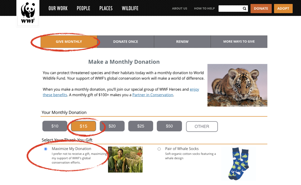
2.) Clicking on the Donate Button immediately defaults to the option to make a monthly donation. WWF knows that building a strong base of monthly support is more important than ever. The $15 option, as well as the option to not receive a gift in return for my donation are pre-selected.
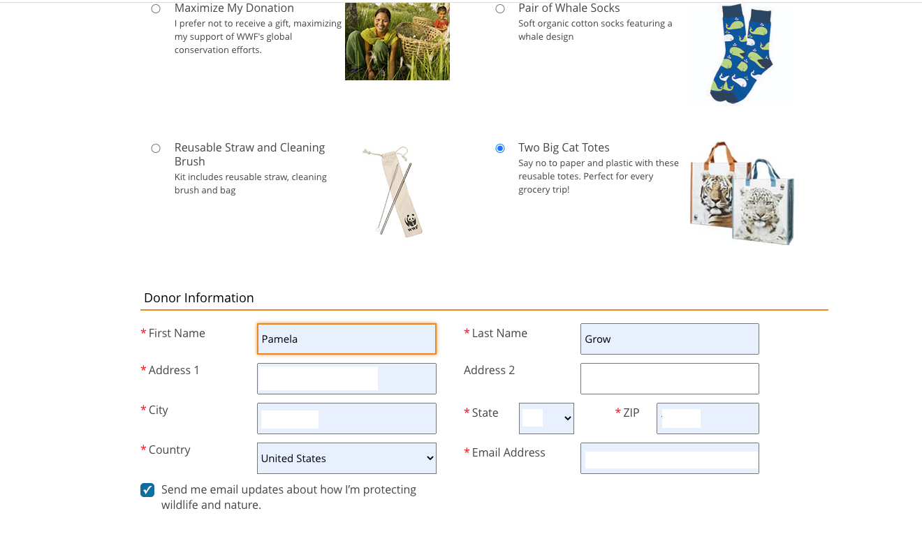
3.) But I want the Two Big Cat Totes, so I select that option. The option to receive email updates is pre-selected.
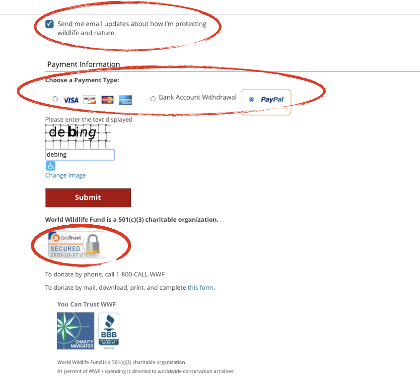
4.) WWF offers the option of credit card, bank account withdrawal, and PayPal. Each one is seamless. Research has shown that simply using the image of a lock on the donate page implies security. The additions of the BBB accreditation and Charity Navigator adds to the donor’s sense of trust. They also include the option to donate by phone or by mail.
5.) Once my gift is processed, I am redirected to this thank you page on the WWF site.
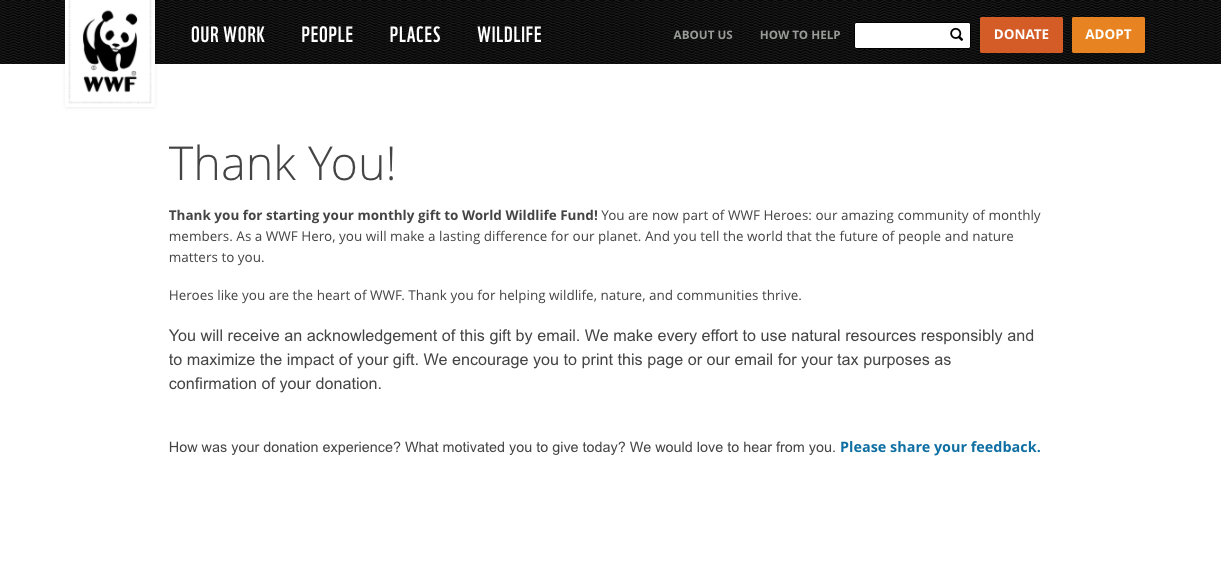
This experience was effortless and took all of a few seconds. Your online giving systems are not something you set and forget. Walkthrough your organization’s processes regularly. Test both the online process and mobile.


 I can’t wait to meet with you personally.
Comments on this entry are closed.