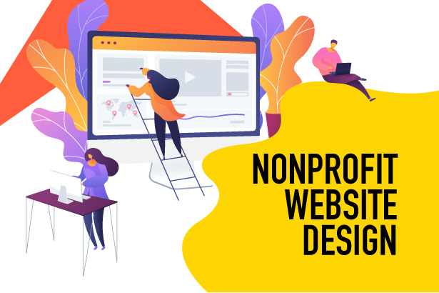
Your nonprofit’s website is one of the most important outreach tools you have at your disposal. It’s at the center of a strong marketing strategy—supporters who hear about your organization through other channels will probably go to your website to learn more.
Your website also provides convenient opportunities for visitors to get involved with your mission by donating, registering for events, signing up to volunteer, or even just subscribing to your newsletter. If they have a positive user experience, they’ll be more likely to keep engaging with your organization, helping you build stronger supporter relationships.
Whether you’re just getting started with nonprofit web design or are looking for ways to improve your existing website, make sure to include these four essential elements:
- Mission Statement
- Calls to Action
- Impact Information
- Visual Branding
According to Loop, the best nonprofit websites draw audiences in, instill a sense of trust, and inspire action. Start by researching other organizations’ websites to determine their strengths and brainstorm ways you could improve yours. Let’s dive in!
1. Mission Statement
Your nonprofit’s mission statement informs everything your team does day to day. It should be a central component of your website design as well.
If your mission statement is just a sentence or two, include it on the homepage so visitors understand your organization’s purpose as soon as they land on your website. If it’s longer, consider including the full statement on your About page and developing a shorter version for the homepage to save space.
Your mission statement should also inform the rest of your website design process. When choosing photos or videos, make sure the imagery reflects your mission. Consider leveraging storytelling strategies to help readers emotionally connect with your organization’s impact. For example, an animal shelter whose mission statement discussed finding forever homes for dogs and cats in need in the local community could include photos of the animals they rehomed alongside adopter testimonials on their website.
2. Calls to Action
Your website’s calls to action are what drive visitors to engage with your nonprofit. They can lead to supporters getting involved for the first time, then make it easy for them to return and continue engaging in the future. Let’s look at three key opportunities to create calls to action on your website in more detail.
Donation Pages
According to fundraising statistics from Double the Donation, individual online donation revenue increased by nearly 20% from 2021 to 2022. So, your website’s donation page is essential for funding your mission—maximize its effectiveness by trying these tips:
- Make the donate button stand out. Use active language like “Donate Today!” and highlight the button in a color that contrasts with the background.
- Optimize for mobile. Double the Donation also reported that mobile giving grew by nearly 50% from 2021 to 2022. So, make sure that your donation page automatically resizes for different screen sizes and that the button is large enough to tap easily.
- Ensure the page is accessible from anywhere on the website. Include a call-to-action button linking to the donation page in your website’s navigation bar so that visitors are just one click away at all times.
It’s also important to limit the number of form fields on your donation page to capture just the most essential information. Doing so reduces form abandonment rates and encourages more supporters to follow through with their online gift.
Subscription Boxes
Some visitors won’t be ready to donate to your cause yet, but they may want to learn more about it. To reach this audience, include a call to action to encourage supporters to subscribe to your organization’s communications.
Make it clear to the supporter what they’ll receive by subscribing, such as blog updates or your nonprofit’s email newsletter. By providing a low-stakes, immediate action to take, you can keep your subscribers’ attention and give them the information they need to take the next step when they’re ready.
Sign-Up Forms
Additionally, there may be some supporters who want to get involved with your mission but would prefer to give their time. For these supporters, make it easy to register for volunteer opportunities, fundraising events, and advocacy work at your nonprofit.
Similarly to your donation page, keep your online registration forms short to encourage supporters to fill them out completely. Consider creating pages dedicated to volunteering and upcoming events and add a calendar to your website to ensure supporters stay up-to-date on your organization’s activities.
3. Impact Information
Your website also provides a space to showcase your nonprofit’s successes and inform visitors about the larger issues you’re working to address. When supporters see that your organization has made an impact in the past and is actively planning for the future, they’ll be more likely to get involved.
Showing impact to visitors can take a number of forms, including:
- Statistics. Statistics provide concrete evidence that your organization has made progress toward fulfilling your mission. Choose a few powerful statistics to showcase on your website’s homepage, about page, and any pages reflecting your work.
- Testimonials. Whether in the form of short quotes, written stories, or videos, testimonials provide a personal perspective on how your nonprofit has helped your community.
- Your organization’s annual report. There’s a lot of valuable information in your annual reports, including financial details, project updates, and donor acknowledgments. Digitize your report and include it in a prominent place on your website so supporters can easily learn more about any aspect of your nonprofit.
If visitors are on the fence about engaging, impact information shows that their engagement will further your nonprofit’s mission and that you can be trusted to follow through on your promises.
4. Visual Branding
Maintaining consistent branding is not only a best practice for nonprofit web design, but also for nonprofit marketing in general. The visual aspects of your brand help supporters become familiar with your mission and trust that they’re actually getting involved with your nonprofit when they follow your calls to action.
Some aspects of branding to focus on when you design your website include your:
- Color palette. Most organizations choose two or three main brand colours and a few accent shades. Specify not only the colour’s name, but also its six-digit hex code (for instance, “bright yellow” could be #fcfc03 or #f5e90a) to make sure you use the exact same shade every time.
- Typography. To add visual variety to your website, choose two legible brand fonts—one for headings and one for body text. But don’t use more than three typefaces to avoid a cluttered look.
- Logo. Use your brand colours and typography to design a simple but memorable logo for your nonprofit. Then, add it to the top left corner of each of your website pages with a link back to your homepage.
Ensure consistency in your nonprofit’s visual branding by creating a brand guide. In this document, you’ll detail how each of the above elements should be used on your website and in your other marketing materials. This way, anyone inside or outside your organization who works on your content has a reference for how your colours, typography, and logo are best used.
Whether you’re redesigning your nonprofit’s existing website or launching a brand-new one, make sure to focus on the four essential elements above. As you implement the tips in this guide, consider partnering with a nonprofit website design agency that can answer any questions you may have and help you take your site to the next level.


 I can’t wait to meet with you personally.
Comments on this entry are closed.