
In this mailbox installment, I’m once again casting my spotlight on Brittany’s Hope, an organization that I support as a monthly sponsor. I’m emotionally tied to their work and mission, they consistently communicate with me to strengthen our bond, and they’re geographically close to me, located only a couple hours away. “Near and dear to my heart” has rarely been truer than with Brittany’s Hope. Just yesterday, Aaron Fogelman, their Managing Director, reached out to me via email. Here’s what he had to say:
“We’ve been long overdue for an annual report. There just isn’t time for all the projects we have sometimes – so, we are going to do something a bit different. We put together a quick infographic which we are going to print on the back of our letterhead. It’s a tribute to our donors’ successes. I wanted to share it with you because you had a hand in making it happen!”
Here’s the infographic in question, and it’s a draft. Take a look…
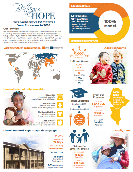
It’s bright, lively, and concise. It reflects donor impact in a meaningful way, without the entire shebang of an annual report. Using beautiful photographs, it illuminates vital statistics in a way that’s accessible and easy to understand. For the most part.
Aaron admits, “I hoped for some thoughts. I’ve gotten comments that it can be a little confusing, but no one seems to be able to tell me what exactly is confusing.”
Right off the bat, I picked up on two things here:
- Although I understand the “100% Model” depicted on the right side, I’m not so sure that donors would. It’s likely they’d need to look up who “DAS Distributors” are, and even then, they still may not understand how they’re connected to Brittany’s Hope or their 100% Model, or what that model means.
- The “1.003 Kids” statistic in regards to Kenya and Ethiopia also has me scratching my head, but I think it’s a typo. Perhaps they meant 1,003?
I put on my donor hat when I assessed this infographic draft and did my best to see it through their eyes. The other details and statistics are easy to understand, and the “Our Promise,” which is tied closely to their mission, is a welcoming introduction. The subtitle of “Your Successes” is just perfect. It begins this condensed report on the best note possible: with gratitude and direct communication. Aaron mentioned that they’ll be printing this infographic on the back of their letterhead. Overall, it’s a job well done, and I’m not only glad that Aaron shared it with me, but flattered that I had a role in making it happen.


 I can’t wait to meet with you personally.
Comments on this entry are closed.